The advantages? More color options. Red, orange and brown just don't cut for the Republican leaning states. Sure that color combination was unique, but it wasn't entirely intuitive in the way that dark red, primary red and pink are. Someone can look at that and see strong McCain states, leaning McCain states and toss ups trending toward the Arizona senator without having to scour a the map for a key.
The other advantage is that the "Where Democrat X Does Best" maps can be condensed into one map. With more than six colors at my disposal (the price for using a free, online map utility), it is much easier to show where Clinton and Obama are doing better than the other and by how much.
The disadvantages? Well, they are the same here as they are with any electoral college map. The result is typically a lot of red. Every map looks like a Republican landslide. But as I told my son today, "People vote. Land doesn't. Do you recall any dirt walking into the fire station to vote when we were there in February?"
"No."
"That's because land area doesn't vote."
Seriously though, you have a decision to make in this endeavor: use a regular map and have a lot of red (distorting the perception of who has the most electoral votes) or use a cartogram that distorts the map beyond recognition (but makes California look bigger than Wyoming to reflect which state has the most electoral college votes). The answer is that you maintain the state shape but expand or contract it in relation to the number of electoral votes. That's something Paul Gurian has been doing for years, but we haven't gotten that up and ready for primetime exposure in this forum yet. By the time of the general election hopefully we will.
Here, though, is what I've got now and would appreciate any feedback on. These are the maps with data updated through today sans analysis (There have been a ton of new polls this week so I'll let the weekly cycle complete itself before I fully comment on it).
The Clinton Map
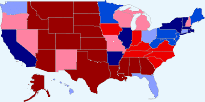 Clinton: McCain:
272 266
The Obama Map
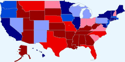 Obama: McCain:
274 264
McCain Margin
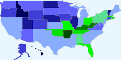 Clinton states (green): 13 Obama states (blue): 37
*The darker a state is the more it favors one candidate over the other.
The comments section awaits.
[Thanks to Robi Ragan for the link to the Soc. Sci. Stat. blog post.]
Recent Posts:
Alaska + Wyoming = Obama + 1 Delegate
Alaska and Wyoming: State Convention Day (18 Delegates at Stake)
Colorado Final Tally: Clinton Gains 1 Delegate
 Clinton: McCain:
272 266
The Obama Map
 Obama: McCain:
274 264
McCain Margin
 Clinton states (green): 13 Obama states (blue): 37
*The darker a state is the more it favors one candidate over the other.
The comments section awaits.
[Thanks to Robi Ragan for the link to the Soc. Sci. Stat. blog post.]
Recent Posts:
Alaska + Wyoming = Obama + 1 Delegate
Alaska and Wyoming: State Convention Day (18 Delegates at Stake)
Colorado Final Tally: Clinton Gains 1 Delegate


