The advantages? More color options. Red, orange and brown just don't cut for the Republican leaning states. Sure that color combination was unique, but it wasn't entirely intuitive in the way that dark red, primary red and pink are. Someone can look at that and see strong McCain states, leaning McCain states and toss ups trending toward the Arizona senator without having to scour a the map for a key.
The other advantage is that the "Where Democrat X Does Best" maps can be condensed into one map. With more than six colors at my disposal (the price for using a free, online map utility), it is much easier to show where Clinton and Obama are doing better than the other and by how much.
The disadvantages? Well, they are the same here as they are with any electoral college map. The result is typically a lot of red. Every map looks like a Republican landslide. But as I told my son today, "People vote. Land doesn't. Do you recall any dirt walking into the fire station to vote when we were there in February?"
"No."
"That's because land area doesn't vote."
Seriously though, you have a decision to make in this endeavor: use a regular map and have a lot of red (distorting the perception of who has the most electoral votes) or use a cartogram that distorts the map beyond recognition (but makes California look bigger than Wyoming to reflect which state has the most electoral college votes). The answer is that you maintain the state shape but expand or contract it in relation to the number of electoral votes. That's something Paul Gurian has been doing for years, but we haven't gotten that up and ready for primetime exposure in this forum yet. By the time of the general election hopefully we will.
Here, though, is what I've got now and would appreciate any feedback on. These are the maps with data updated through today sans analysis (There have been a ton of new polls this week so I'll let the weekly cycle complete itself before I fully comment on it).
The Clinton Map
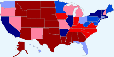 Clinton: McCain:
272 266
The Obama Map
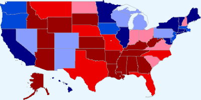 Obama: McCain:
274 264
McCain Margin
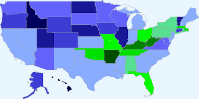 Clinton states (green): 13 Obama states (blue): 37
*The darker a state is the more it favors one candidate over the other.
The comments section awaits.
[Thanks to Robi Ragan for the link to the Soc. Sci. Stat. blog post.]
Recent Posts:
Alaska + Wyoming = Obama + 1 Delegate
Alaska and Wyoming: State Convention Day (18 Delegates at Stake)
Colorado Final Tally: Clinton Gains 1 Delegate
 Clinton: McCain:
272 266
The Obama Map
 Obama: McCain:
274 264
McCain Margin
 Clinton states (green): 13 Obama states (blue): 37
*The darker a state is the more it favors one candidate over the other.
The comments section awaits.
[Thanks to Robi Ragan for the link to the Soc. Sci. Stat. blog post.]
Recent Posts:
Alaska + Wyoming = Obama + 1 Delegate
Alaska and Wyoming: State Convention Day (18 Delegates at Stake)
Colorado Final Tally: Clinton Gains 1 Delegate

13 comments:
Josh,
I really like the new maps. They are much better than the old. There are two minor problems with them.
1.I'm not sure the Republicans will like pink in their color palate.
2. The numbers don't support Clintonian mathematics.
I tend to prefer the land maps to the electoral maps Paul uses, but that probably just because I'm old school.
"The numbers don't support Clintonian mathematics."
Of course not. They're based in reality.
I prefer the old style of maps. They're cleaner and sharper. Also, when it comes to maps looking overly red, I think that's relatively inconsequential since the average reader is more than aware of how the electoral system works. People know that just because the mid-west and the bible belt are solid red the republicans don't necessarily have the votes.
Why not use both styles of maps? Keep the sharper ones for most things, but use the new one for the McCain margin, so that you can keep it condensed to one map.
Thanks Anton. Good points. The old maps are much bigger (if clicked on) and are sharper.
I should have added one other, selfish, advantage to the new maps: The new map maker allows for editing whereas the old one required me to create new maps every week. So part of the draw of the new maps is that I don't have to spend as much time making them.
I like the new style better. It's a lot easier for me to quickly identify states that are close, and whom they lean toward.
I don't think cartograms are good for this kind of weekly update. We're all pretty conditioned to recognize states in their geographical shape; with the cartogram I'd end up spending more time trying to figure out what some of the states were.
I like the old maps better. Not for practical purposes, but more for an aesthetically pleasing purpose.
Unless these items are changed, I'd prefer the old maps.
1) map size, the new maps are too small
2) sharp lines between states, in the new maps, neighboring states of a a similar color just kind of mesh together, hampering ease of use.
Thanks for these maps.
I have a question that's not about the map design.
Can you tell me (in layperson's terms) how your statistical method differs from the one that yields such a strong Clinton tilt over at electoral-vote.com?
Thanks.
Meg (Obama supporter)
Anonymous,
Agreed. From a "clickability" standpoint, the newer maps don't hold a candle to the older ones. What you see when you click is basically what you get (I've always hated sites that have that issue.). The older ones provide a much larger picture when clicked. This is an introductory roll out. Not the finished product. Ultimately I'd like to enhance things with a few more bells and whistles.
Meg,
These maps favor Obama because I include all the polls taken since Super Tuesday, but discount all but the three most recent. Electoral-vote simply focuses on the most recent poll or polls (two or three). They are more volatile as a result.
And yes, Clinton's standing has improved at a higher rate than Obama's in some of the swing states (esp. Ohio and Pennsylvania), so her numbers have jumped a bit lately. Just not as much as her campaign would have you believe. In the aggregate, there just isn't that much difference between the candidates now in terms of the electoral college outlook.
Josh, have you tried simply editing the maps in Windows Paint? They're only simple .gif images when saved, so you can open them with paint and use the fill button. Even better, you can use whatever colors you want. Send me an e-mail at PasquillScissors @ hotmail.com and I'll e-mail you an example.
There is a very clear distorted electoral map here: http://bigpicture.typepad.com/writing/2004/11/the_us_electora.html
I like that it has individual squares, because it doesn't try to look like a real map, but still shows things in proportion.
Thanks Anonymous. It is probably silly for me to roll out a new map(s) now. Once things shift into
general election mode, Paul Gurian and I will start posting a different map. It maintains the traditional alignment and shape of the states, but rescales them in proportion to the number of electoral votes each state has.
Should the Rules and Bylaws Committee decide the Florida and Michigan situation this weekend and should Obama win on Tuesday (Yes, there's Puerto Rico too.), then we may post one of those maps, if not next Wednesday, then the Wednesday after that. It all kind of depends on what Clinton decides to do and if the polling firms continue to include the Clinton/McCain question (some have already stopped). If she's still in and there continues to be data, I'll continue examining the electoral college landscape with two Democrats.
Post a Comment